The Use of Different Colors in Interior Design and Posters
Color plays a crucial role in room design. The right choice of color palette can help create the desired atmosphere, set the mood, and influence human behavior, transforming any space into something cozy, stylish, and functional.
The Psychology of Color in Interiors
Each color carries specific associations and emotions, which can be utilized to achieve various design objectives.
Warm Colors
Warm colors include red, orange, and yellow, as well as their variations. These are the colors of fire, autumn leaves, sunrises, and sunsets, which bring energy, passion, and positivity to a space.
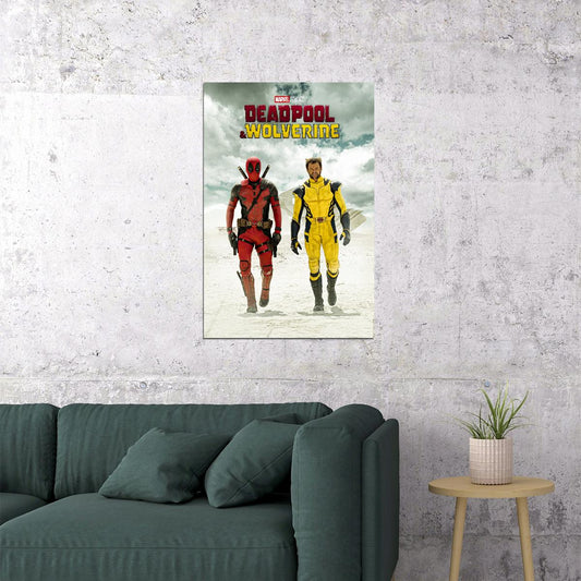
Red and yellow are the main colors, with orange in between. This means that warm colors are really warm, they are created without the addition of cold shades. Use warm colors if you want your design to reflect passion, happiness, enthusiasm and energy.
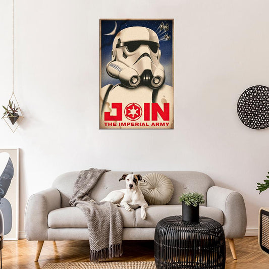
- Red (Primary Color): passion, energy, and power.
It is associated with fire, violence, and war, but also with love and passion. Historically, red has represented both the Devil and Cupid. In China, red symbolizes prosperity and happiness and is thought to bring good fortune. In other Eastern cultures, the bride wears red for a wedding. In South Africa, however, red is the color of mourning. Red can even affect our physiology, increasing blood pressure and breathing rate.
In design, red can serve as a powerful accent. Excessive use of red, particularly in its pure form, can be overwhelming, but if you need to convey power and passion, red is indispensable. Light shades of red are energetic, while dark shades appear powerful and elegant. Red draws attention and evokes strong emotions, making it ideal for accents, such as textiles or decor, to create a dramatic impact.
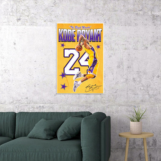
- Yellow (Primary Color): he color of optimism, happiness, and joy.
Often considered the brightest and most energizing of the warm colors, it is associated with happiness and sunlight, though it can also be linked to deceit and cowardice. In design, yellow elements can serve as accents that invigorate the design and add dynamism.
- Orange (Secondary Color): a bright and energetic color.
It is often associated with earth and autumn. In design, orange attracts attention but is less overwhelming than red. It is often perceived as friendlier and more welcoming.
Cool Colors
Cool colors, such as green, blue, and purple, are more subdued. They are the colors of the night, water, nature, and typically appear calming, relaxing, and restrained.
- Blue (Primary Color): represents calm, tranquility, and stability.
Light shades of blue appear fresh and friendly, while dark blue is strong and reliable. Blue also represents peace and has religious connotations in many cultures. It helps to relax and focus, making it ideal for posters designed for meditative or educational purposes.
- Green (Secondary Color): is associated with nature, harmony, and freshness.
It symbolizes new beginnings and growth. Green is calming, promotes relaxation, and is often associated with ecology and health. In design, green balances and harmonizes, creating a sense of stability. Bright shades of green look more energetic, while olive shades usually connect with nature.
- Purple (Secondary Color): is associated with luxury, spirituality, and creativity.
It has long been linked to royalty and nobility. In design, dark purple colors create a sense of wealth and luxury, while light purple looks softer and is associated with spring and romance.
Neutral Colors
Neutral colors usually serve as a background in design. They are often combined with bright color accents but can also stand alone to create subtle layouts.
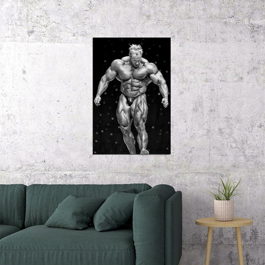
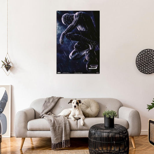
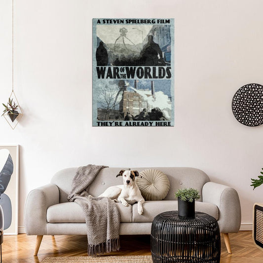
- Black: the color of strength, elegance, and formality.
It is often associated with evil, death, and mystery. In Western countries, black is the color of mourning. Black can be both conservative and modern, traditional and unconventional—it all depends on the colors with which it is combined. Black helps create a sense of sophistication and mystery in design.
- White: symbolizes purity, simplicity, and freshness.
On Western weddings, brides wear white. White is also associated with healthcare, especially with doctors, nurses, and dentists. In design, white usually provides a neutral background that allows other colors to stand out more. It brings cleanliness and simplicity to a design, making spaces appear larger and brighter, which is why it is very popular in minimalist designs.
- Grey: is a universal color that symbolizes neutrality and restraint.
Sometimes grey is seen as gloomy and depressing. In some designs, light grey can be used instead of white, and dark grey instead of black. Grey is often considered conservative and formal, but it can also look modern. It is usually used in corporate designs where formality and professionalism are key.
- Brown: is associated with the earth, wood, and stone.
It conveys reliability, constancy, and down-to-earth qualities. In design, brown is often used as a background color. Sometimes it appears in wood or stone textures. Brown brings warmth and integrity to a design.
- Beige: is somewhat unique as it can be either warm or cool, depending on the colors surrounding it.
It carries the warmth of brown and the coolness of white. In most cases, beige looks conservative and is usually used as a background color. It can also symbolize religiosity.
Color Combinations
It’s important not only to choose colors but also to combine them correctly:
- 60-30-10 Rule: 60% for the primary color, 30% for the secondary color, and 10% for the accent color. This classic formula helps balance the color palette and avoid oversaturation.
- Complementary Colors: Using colors located opposite each other on the color wheel (like blue and orange) creates a vibrant contrast and dynamic in the interior. This combination is often used for accents and drawing attention.
- Monochromatic Palette: Combining different shades of one color creates a calm and cohesive look. This is an excellent option for those who prefer a restrained and elegant style.
Color and Room Function
Each room in the home has its function, and the choice of color should take this into account:
- Bedroom: Use soft, calming colors like blue, pastel shades of green, and gray. These colors promote relaxation and a peaceful sleep.
- Living Room: Warmer and more energetic colors like beige, terracotta, and warm gray are suitable for living rooms. Bright accents like pillows or rugs can be added.
- Kitchen: Yellow and orange tones stimulate appetite and activity, making the kitchen more cozy and inviting.
- Bathroom: Blue and green colors create a sense of freshness and cleanliness. White is also popular as it makes the space appear visually cleaner and more spacious.

The right choice of color palette can significantly impact your interior. Consider the psychology of color, its combinations, and the purpose of the room. Our store offers a wide variety of posters in different colors that perfectly bring your idea to life!
- 𝚄𝚗𝚜𝚞𝚛𝚙𝚊𝚜𝚜𝚎𝚍 𝚙𝚛𝚒𝚗𝚝 𝚚𝚞𝚊𝚕𝚒𝚝𝚢: 𝙾𝚞𝚛 𝚙𝚘𝚜𝚝𝚎𝚛𝚜 𝚊𝚛𝚎 𝚙𝚛𝚒𝚗𝚝𝚎𝚍 𝚘𝚗 𝚊𝚛𝚌𝚑𝚒𝚟𝚊𝚕 𝚖𝚊𝚝𝚎𝚛𝚒𝚊𝚕𝚜 𝚞𝚜𝚒𝚗𝚐 𝚑𝚒𝚐𝚑-𝚚𝚞𝚊𝚕𝚒𝚝𝚢 𝚒𝚗𝚔𝚜, 𝚠𝚑𝚒𝚌𝚑 𝚐𝚞𝚊𝚛𝚊𝚗𝚝𝚎𝚎𝚜 𝚟𝚒𝚋𝚛𝚊𝚗𝚝 𝚌𝚘𝚕𝚘𝚛𝚜 𝚊𝚗𝚍 𝚜𝚑𝚊𝚛𝚙 𝚒𝚖𝚊𝚐𝚎𝚜 𝚝𝚑𝚊𝚝 𝚠𝚒𝚕𝚕 𝚕𝚊𝚜𝚝 𝚏𝚘𝚛 𝚢𝚎𝚊𝚛𝚜.
- 𝚆𝚒𝚍𝚎 𝚜𝚎𝚕𝚎𝚌𝚝𝚒𝚘𝚗 𝚘𝚏 𝚜𝚝𝚢𝚕𝚎𝚜 𝚊𝚗𝚍 𝚝𝚑𝚎𝚖𝚎𝚜: 𝙵𝚛𝚘𝚖 𝚖𝚒𝚗𝚒𝚖𝚊𝚕𝚒𝚜𝚝 𝚍𝚎𝚜𝚒𝚐𝚗𝚜 𝚝𝚘 𝚟𝚒𝚋𝚛𝚊𝚗𝚝 𝚊𝚋𝚜𝚝𝚛𝚊𝚌𝚝𝚒𝚘𝚗𝚜 𝚊𝚗𝚍 𝚛𝚎𝚙𝚛𝚘𝚍𝚞𝚌𝚝𝚒𝚘𝚗𝚜 𝚘𝚏 𝚏𝚊𝚖𝚘𝚞𝚜 𝚠𝚘𝚛𝚔𝚜 𝚘𝚏 𝚊𝚛𝚝, 𝚠𝚎 𝚑𝚊𝚟𝚎 𝚊 𝚙𝚘𝚜𝚝𝚎𝚛 𝚝𝚑𝚊𝚝 𝚠𝚒𝚕𝚕 𝚙𝚎𝚛𝚏𝚎𝚌𝚝𝚕𝚢 𝚖𝚊𝚝𝚌𝚑 𝚢𝚘𝚞𝚛 𝚒𝚗𝚝𝚎𝚛𝚒𝚘𝚛.
- 𝚁𝚎𝚐𝚞𝚕𝚊𝚛𝚕𝚢 𝚞𝚙𝚍𝚊𝚝𝚎𝚍 𝚌𝚘𝚕𝚕𝚎𝚌𝚝𝚒𝚘𝚗: 𝚆𝚎 𝚌𝚘𝚗𝚜𝚝𝚊𝚗𝚝𝚕𝚢 𝚊𝚍𝚍 𝚗𝚎𝚠 𝚙𝚘𝚜𝚝𝚎𝚛𝚜 𝚝𝚘 𝚘𝚞𝚛 𝚌𝚘𝚕𝚕𝚎𝚌𝚝𝚒𝚘𝚗, 𝚜𝚘 𝚢𝚘𝚞 𝚌𝚊𝚗 𝚊𝚕𝚠𝚊𝚢𝚜 𝚏𝚒𝚗𝚍 𝚜𝚘𝚖𝚎𝚝𝚑𝚒𝚗𝚐 𝚗𝚎𝚠 𝚊𝚗𝚍 𝚒𝚗𝚝𝚎𝚛𝚎𝚜𝚝𝚒𝚗𝚐.


